A shop sign has to work with the room around it. The lettering may look convincing in a design file, but the final test comes when it is installed above real furniture, beside real products, and under the lighting people experience every day.
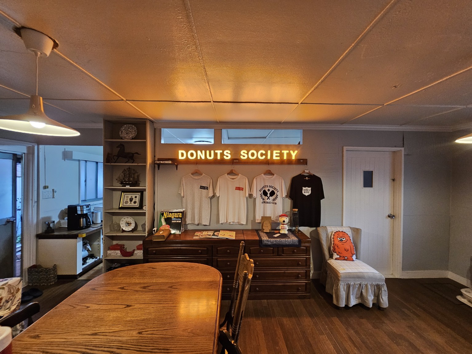
For this USKYLED project, that setting was DONUTS SOCIETY, a donut shop in Japan. We supplied custom magnetic illuminated letters spelling the shop’s name. The finished photographs show an orange glow above a merchandise display, with wooden cabinets, hanging T-shirts, vintage objects and a small seating area giving the interior its character.
The customer’s response was direct: the colour looked right, the size and balance met their expectations, and the completed sign made them happy. They also described a practical installation question about wiring and the direction of the input module, which we helped resolve.
Together, the photographs and feedback tell a useful story about custom magnetic LED letters. Appearance matters, but so do proportion, placement and support through the final connection. This case study looks at the result and the questions worth discussing when planning a similar sign for a café, bakery, boutique or retail interior.
The Setting: A Brand Name Above a Merchandise Display
In the finished installation, DONUTS SOCIETY sits in a single line above a wooden rail. Branded T-shirts hang beneath it, and a group of wooden cabinets forms the lower part of the display. Shelving to one side holds decorative objects, while a chair and table make the wider room feel occupied and personal.
That context matters. A sign viewed on its own is largely a question of letters and light. Here, it also needs to relate to the display below, the windows above and the furniture around it. The illuminated name gives the merchandise wall a clear focal point without requiring a separate, oversized signboard in the composition.
The customer identified the business as a donut shop owned by their son. The photographs show a particular part of that interior, rather than the entire premises. Our discussion therefore focuses on the branding and display area that is visible, without making assumptions about the shop layout, customer capacity or location within Japan.
Why the Orange Colour Matters to This Project
The customer specifically highlighted the orange colour in their feedback. In the supplied photographs, the illuminated letters introduce a warm visual note against the pale wall. That colour sits comfortably alongside the wood tones in the cabinets, rail and table.
There is also a useful distinction between the appearance of the sign and a technical lighting specification. The photographs communicate the visual character of the result, and the customer calls the colour orange. They do not establish a measured colour temperature, wavelength or brightness. For another order, the desired colour should be discussed through a reference and an agreed sample rather than inferred from a photograph alone.
For a café or bakery owner, this is a practical starting point: decide how the lettering should relate to the interior before choosing a colour. A sign might repeat a brand accent, complement a material or deliberately stand apart from the background. In this case, the finished appearance received exactly the response the customer had hoped for.
Letter Size and Overall Balance
Colour was only part of the feedback. The customer also said the size and overall balance were right. Those words are particularly relevant to custom signage because individual letter height does not tell the whole story.
A long business name needs room for both the characters and the spaces between them. The gap separating two words also affects how the name reads. In the DONUTS SOCIETY installation, the two words occupy a horizontal zone above the merchandise rather than filling the whole wall. There is visible space around the name, so the sign can be read as one element within the display.
For a new project, it helps to provide a straight-on photograph of the wall with its available width and height. Include the position of windows, shelves, hooks and other fixed features. A proposed layout can then be assessed in context, rather than approved as isolated lettering on a blank page.
The goal is a sign that looks intentional from the normal viewing position, not simply the largest set of letters that will fit.
From Production Photographs to the Finished Interior
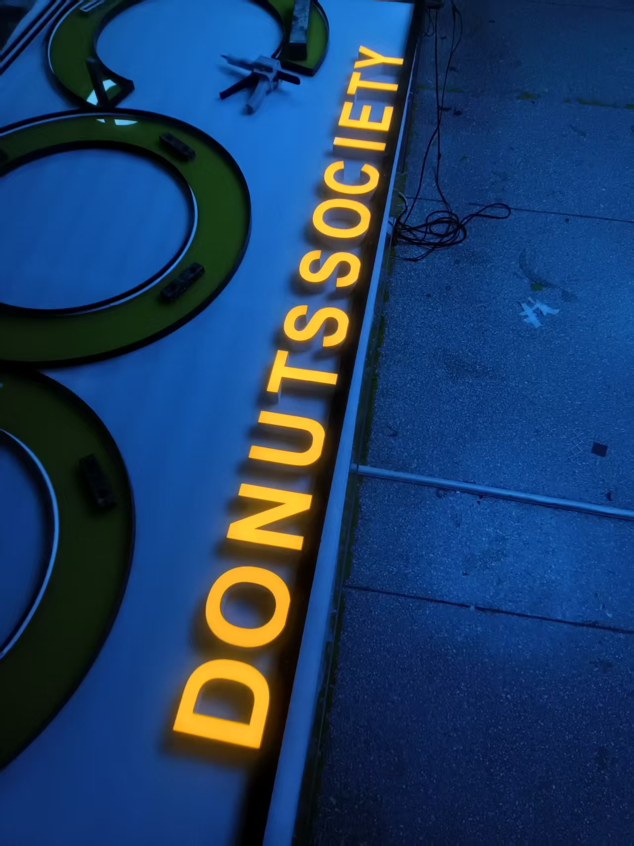
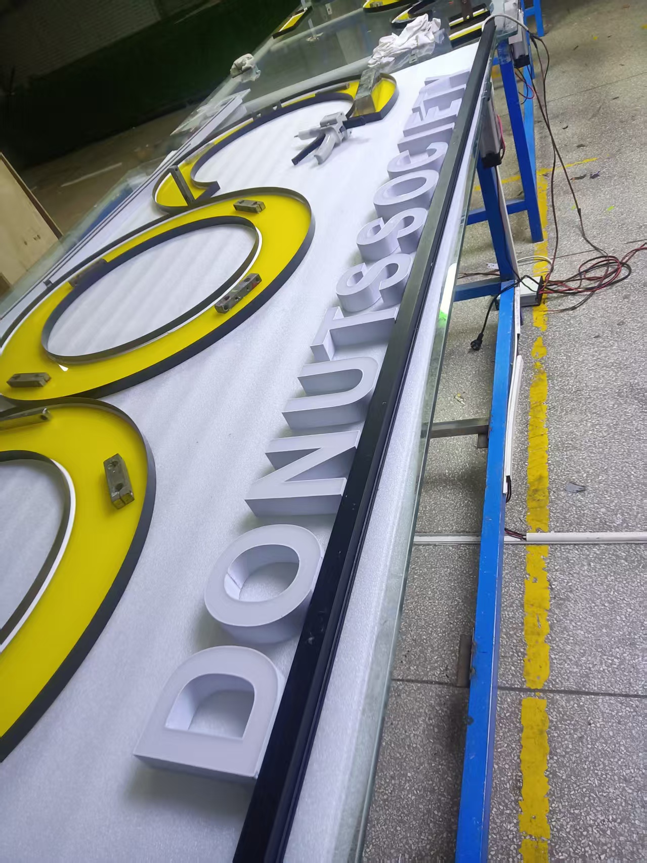
The supplied production photographs show the DONUTS SOCIETY letters before installation, including views with the lettering illuminated and unlit. These images make the physical form of the characters easier to see than a finished room photograph alone.
They also show why different types of project images answer different questions. An unlit production view helps a buyer examine the letter shapes and construction appearance. A powered view shows how the illuminated faces read together. The finished interior reveals whether the complete name belongs in its intended setting.
These photographs are evidence of those visible stages; they are not a substitute for a dimension drawing or electrical specification. For buyers preparing a similar order, it is useful to request both kinds of information. Visual confirmation supports design decisions, while the approved technical details guide installation.
Showing the actual letters as well as the completed display also gives a case study more substance. Readers can see the object that was supplied and the space in which it was used.
What the Customer Said After Installation
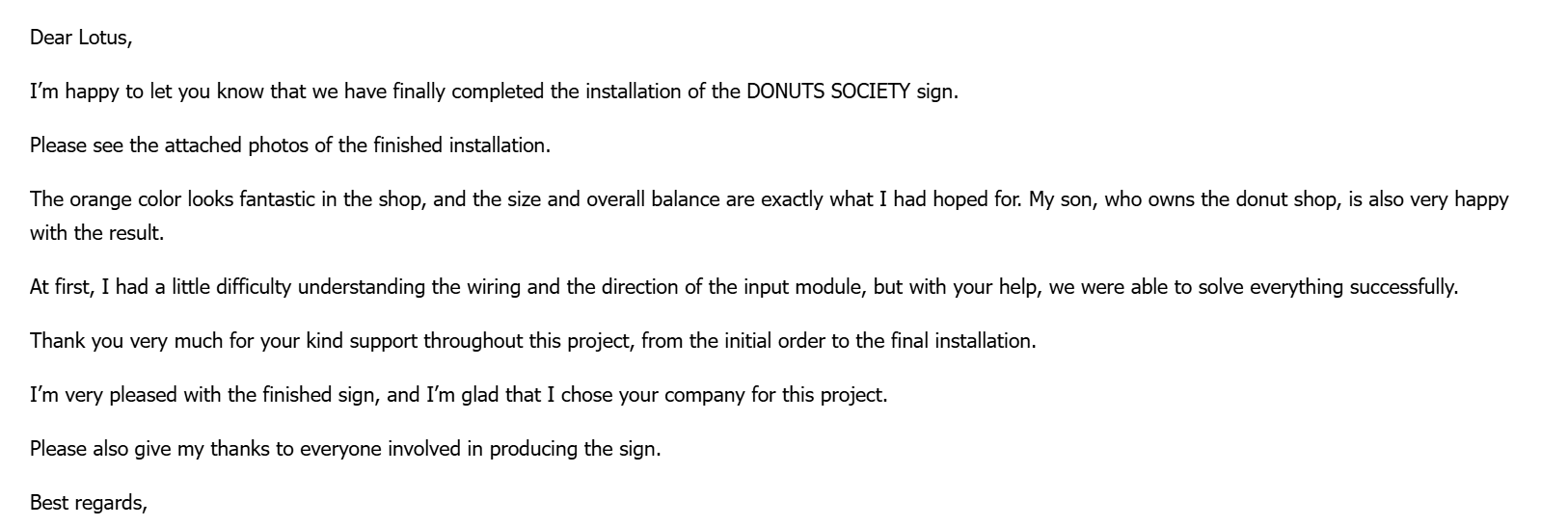
After the installation was completed, the customer sent photographs and a written message to USKYLED. One sentence captures the design result particularly well:
“The orange color looks fantastic in the shop, and the size and overall balance are exactly what I had hoped for.”
The message also said that the shop owner was very happy with the result. The customer thanked the team for support from the initial order through to final installation and asked for their thanks to be passed to the people involved in producing the sign.
That feedback supports a specific conclusion: this customer was pleased with the finished sign and the assistance received. It does not tell us how the sign affected sales, foot traffic or social media engagement, so those outcomes are not claimed here.
For a custom project, a clear report that the colour, dimensions and overall appearance met expectations is already meaningful. It connects the supplied product to the brief and to the customer’s experience of the completed space.
The Installation Detail That Needed Clarification
The feedback also included a detail that is easy to leave out of a promotional story. At first, the customer had some difficulty understanding the wiring and the direction of the input module. With help from USKYLED, they were able to resolve the issue and complete the installation.
This makes the case more useful to another buyer. A magnetic sign can still have an electrical connection and a defined assembly method. The word “magnetic” should not be taken to mean that the entire system requires no wiring, accepts any power supply or can be connected in either direction.
For this project, the customer’s message confirms that guidance was needed and that the issue was resolved. It does not provide enough detail to reconstruct the wiring procedure, so this article does not attempt to give one.
When planning a new order, ask for instructions that match the exact sign configuration. Clear identification of the input module, connection points and power equipment can make the installation handover easier to follow.
What to Establish Before Ordering Magnetic Illuminated Letters
Start with the artwork. Provide the exact wording, logo or lettering file that should be reproduced. If the business name has a particular typeface, letter spacing or custom character shape, include the original artwork rather than relying on a typed name in a message.
Next, describe the intended location. An interior merchandise wall, a reception desk and an exterior shopfront present different design and installation questions. The DONUTS SOCIETY photographs show an indoor display, so this case should not be treated as evidence of an outdoor protection rating.
Then define the visible result: approximate overall width, preferred letter height, light colour and the appearance when the sign is switched off. It is also useful to identify where the sign will be viewed from and what objects will sit around it.
Finally, clarify the mounting and power arrangement with the supplier. Ask what is included in the quotation, what must be provided locally and which parts need access after installation. These discussions should take place before production approval rather than after the package reaches the site.
Think About the Complete Name, Not Only Individual Letters
A custom illuminated sign is read as a word or logo, even when it is assembled from separate characters. That makes consistency across the whole name an important part of the design review.
Ask to see the full layout at the intended proportions. Check the spacing between repeated letters, the gap between words and the relationship between the lettering and its supporting element. A close-up image can be useful, but it cannot replace a view of the complete name.
DONUTS SOCIETY provides a straightforward example. The sign contains two clearly separated words, set above a longer wooden display feature. The finished photograph lets the viewer judge the full composition rather than only the quality of one character.
For other brands, the challenge may be different. A narrow wordmark, mixed letter heights or an accompanying symbol may require a different arrangement. Treat the approved full-size layout as a project decision, rather than assuming that a standard spacing rule will suit every name.
Consider the Sign in Both Its Lit and Unlit States
Most promotional images of illuminated letters are taken with the sign switched on. That is understandable, but a commercial interior also needs to look considered when the lettering is off.
The unlit production photograph in this project shows the physical characters without the orange illumination. The finished photographs show how their illuminated appearance relates to the room. Together, they encourage buyers to review both states before approving a similar project.
For your own sign, ask about the face and side appearance under normal room lighting. Consider how visible the supporting components will be from nearby seats or from an angled approach. The best viewing position for a photograph may not be the only position from which customers see the sign.
This is especially relevant in smaller cafés and boutiques, where people can stand close to the lettering. A clear daytime view and a powered view can reveal different aspects of the same design and make approval more informed.
Build the Power and Service Arrangement Into the Brief
The visible letters are only one part of the supplied system. The project brief should also address how power reaches the sign and where any separate components will be placed.
Ask the supplier to identify the required input supply, the sign’s operating requirements and the compatible power equipment for the exact order. Do not select those details from the destination country alone or from a different product that looks similar.
The location of the power equipment deserves attention as well. Discuss cable routing and future access with the installer before the display is closed up or furniture is fixed in place. A discreet arrangement should still allow the relevant components to be reached for inspection or service.
The customer’s question about the input module in this project is a reminder to make the handover concrete. Labelled images and configuration-specific instructions can be more useful than a generic description of magnetic lettering. Confirm who will make the connections and who can answer questions during installation.
How to Review a Sample or Pre-Shipment Presentation
A sample or a clear pre-shipment presentation can help connect the artwork approval to the physical product. Begin by checking the exact wording. This sounds basic, but spelling, character order and punctuation should be reviewed before attention moves to the lighting effect.
Look at the overall layout, then at individual letter details. Compare the visible finish and lit colour with the agreed reference. Where colour matching is important, agree how it will be assessed; camera exposure and display settings can change the appearance of a photographed sign.
Request the dimensions and connection information alongside the images. If the supplied system includes separate components, ask for an itemised packing list so the installer knows what to expect.
These are suggested review steps for a future project, not a claim that every one of them was documented for DONUTS SOCIETY. The material supplied for this case shows production views, finished installation photographs and the customer’s feedback. That is the evidence on which the project story is based.
Applications for Cafés, Bakeries and Retail Interiors
The most direct lesson from this project is how a business name can sit within a merchandise display. The illuminated letters identify the brand above the products, while the surrounding furniture carries the practical display function.
A café might use a similar approach above a retail coffee shelf. A bakery could consider lettering near a packaged-product display. A boutique might place its name within a reception or feature-wall composition. These are possible design directions to discuss, rather than identical installations that can be copied without checking the site.
The relevant questions remain the same: what should visitors notice first, how much space is available, and how should the lettering relate to the materials already present? A sign that suits a pale wall and dark wood may need a different treatment against glass, polished stone or a strongly coloured background.
For designers and shopfitters, sharing those surrounding details early gives the supplier a more useful brief than a logo file alone.
A Better Brief for Your Next Custom LED Sign
When contacting USKYLED, send the business name or logo together with an image of the intended installation area. Include approximate dimensions, the preferred illuminated colour and any finish references that matter to the design.
Explain whether the request is for one completed sign, a sample for evaluation or a series of signs for different locations. For multiple sites, distinguish the elements that must remain consistent from the measurements that may change.
Also state the delivery destination, target installation date and any project documentation requirements. Ask for the quotation to identify the supplied components, mounting arrangement and electrical configuration clearly. Custom production and shipping schedules should be confirmed for the actual order.
If an installer is involved, include their technical questions before the design is finalised. The DONUTS SOCIETY experience shows the value of answering practical questions through to installation. A detailed brief helps bring that support into the process earlier and keeps visual expectations connected to the supplied system.
Bringing the Brand Into the Room
The finished DONUTS SOCIETY sign is a specific solution for a specific interior: orange illuminated lettering, a horizontal placement above merchandise and a room with strong wooden and vintage details. The customer’s response confirms that the colour, size and balance worked for their project.
The case also shows that support is part of the result. The customer had a question about wiring and input module orientation, received help and completed the installation. That experience belongs in the story alongside the photographs.
If you are planning custom magnetic LED letters for a café, bakery, boutique or retail display, contact USKYLED with your artwork and an image of the space. We can discuss the intended appearance and the information needed to define a quotation for your project.
Discuss your custom illuminated sign with USKYLED.


